STEELHAUS USA
Catalogue
Highlighting engineering precision through clean, functional design that wins big sales.
Client: Steelhaus Inc
My Role: Creative Direction and Design
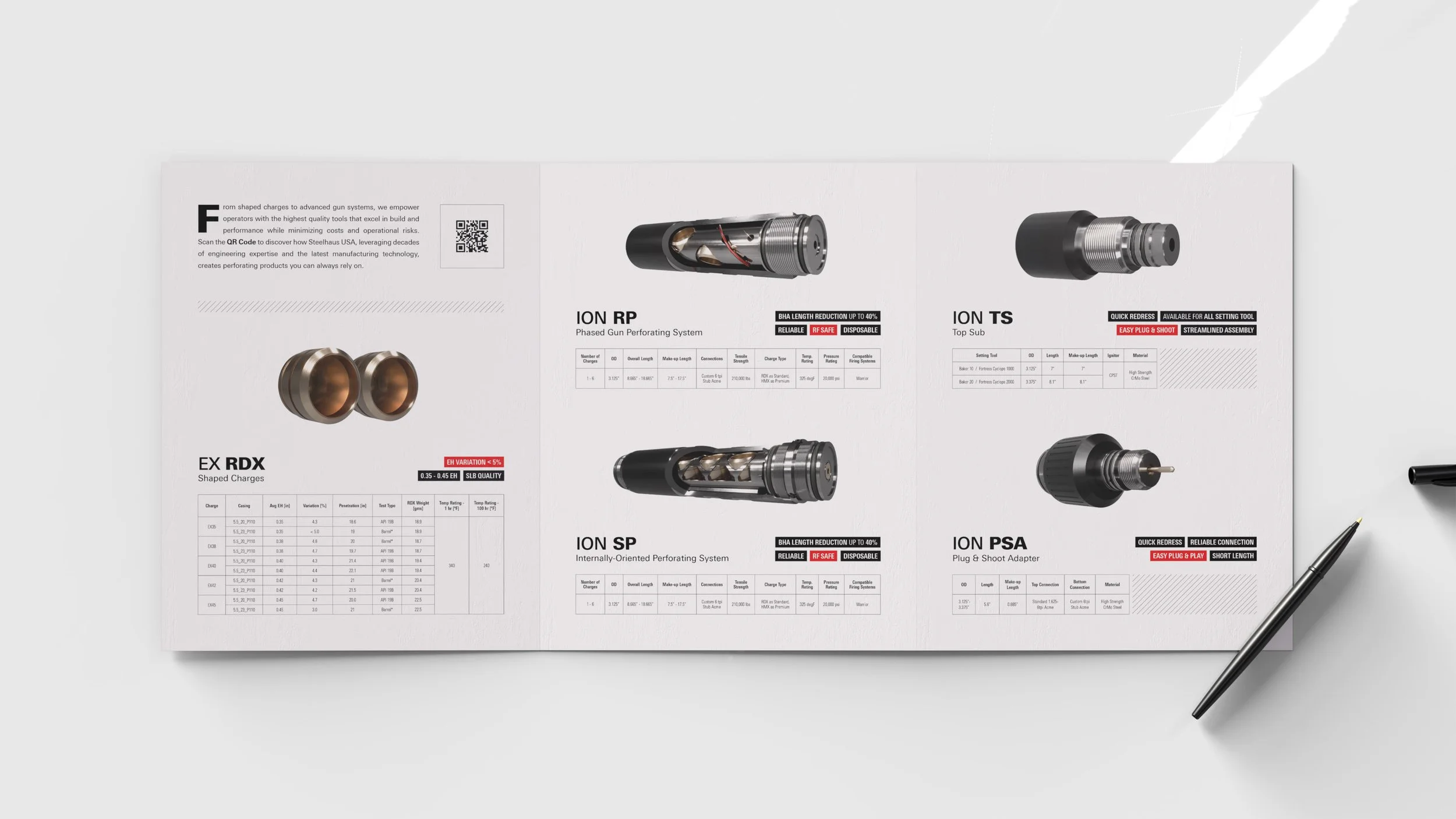
Showcased the entire product range in a single spread to instantly communicate Steelhaus’s focused scope and unwavering quality.
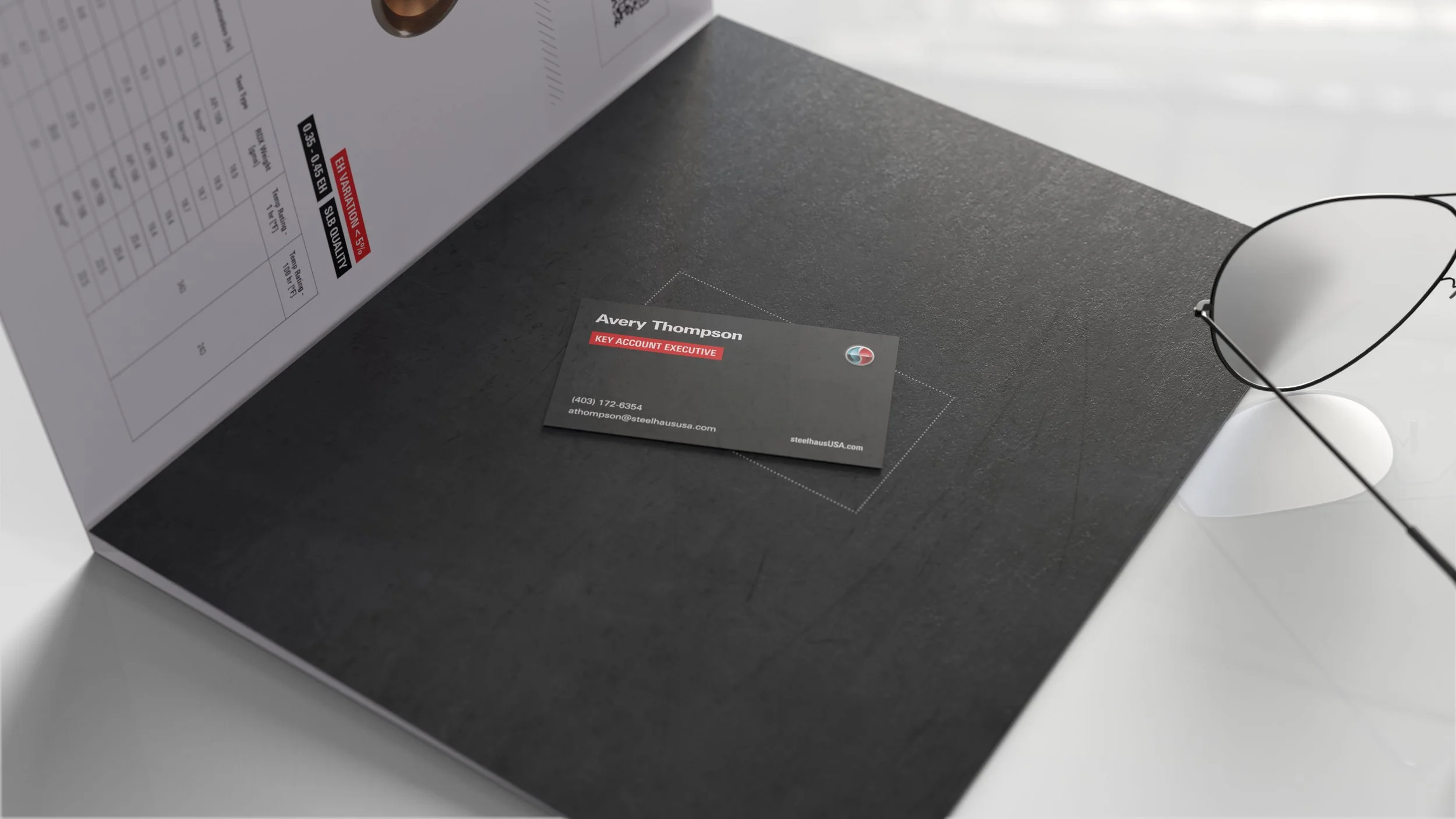
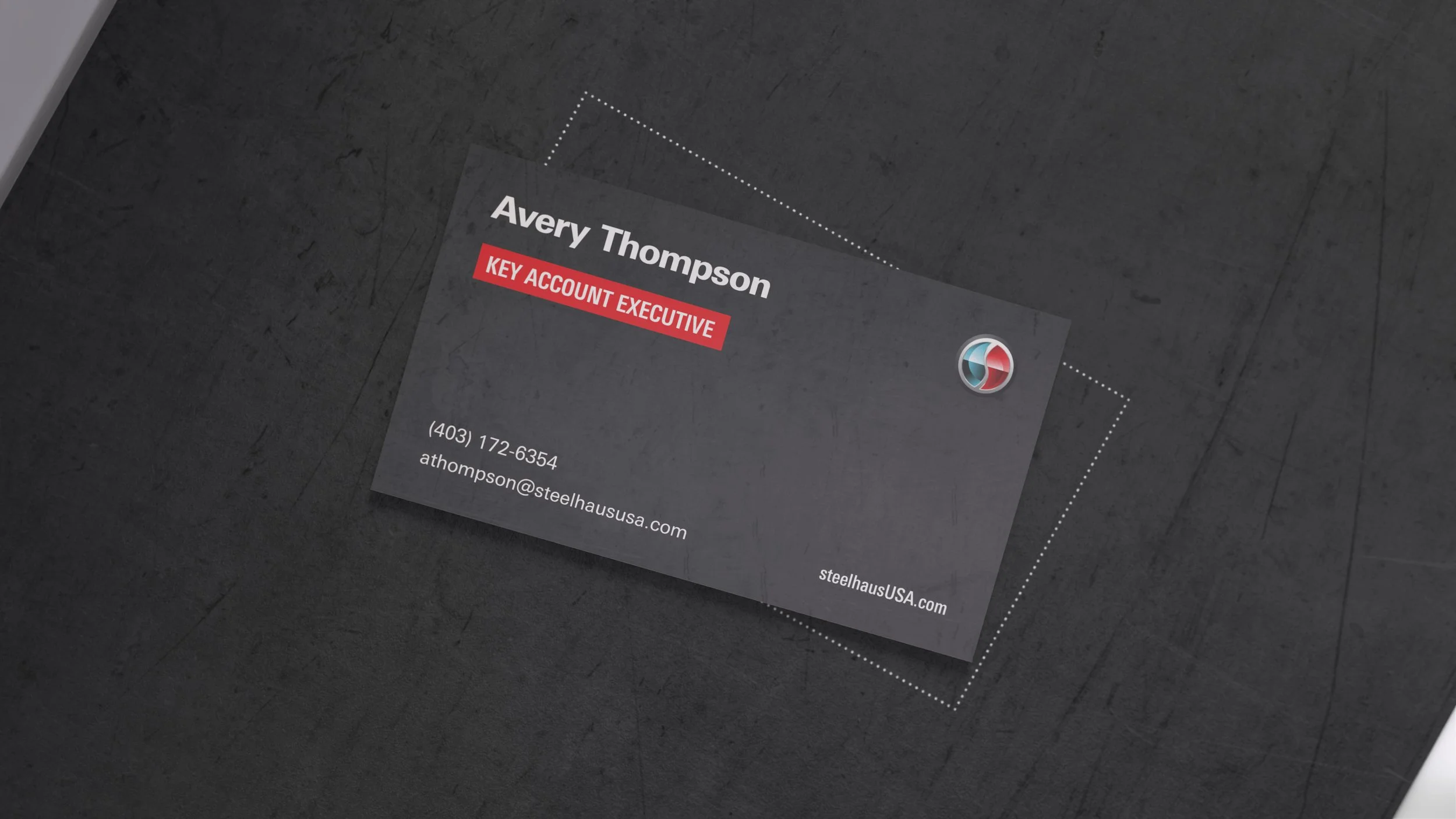
Placed the business card at the center of the opening spread — putting the means to connect front and center.
Designed the brochure as a desk-worthy tool — engaging visuals, high-quality stock, and writable space make it worth keeping in sight, keeping the brand top of mind.
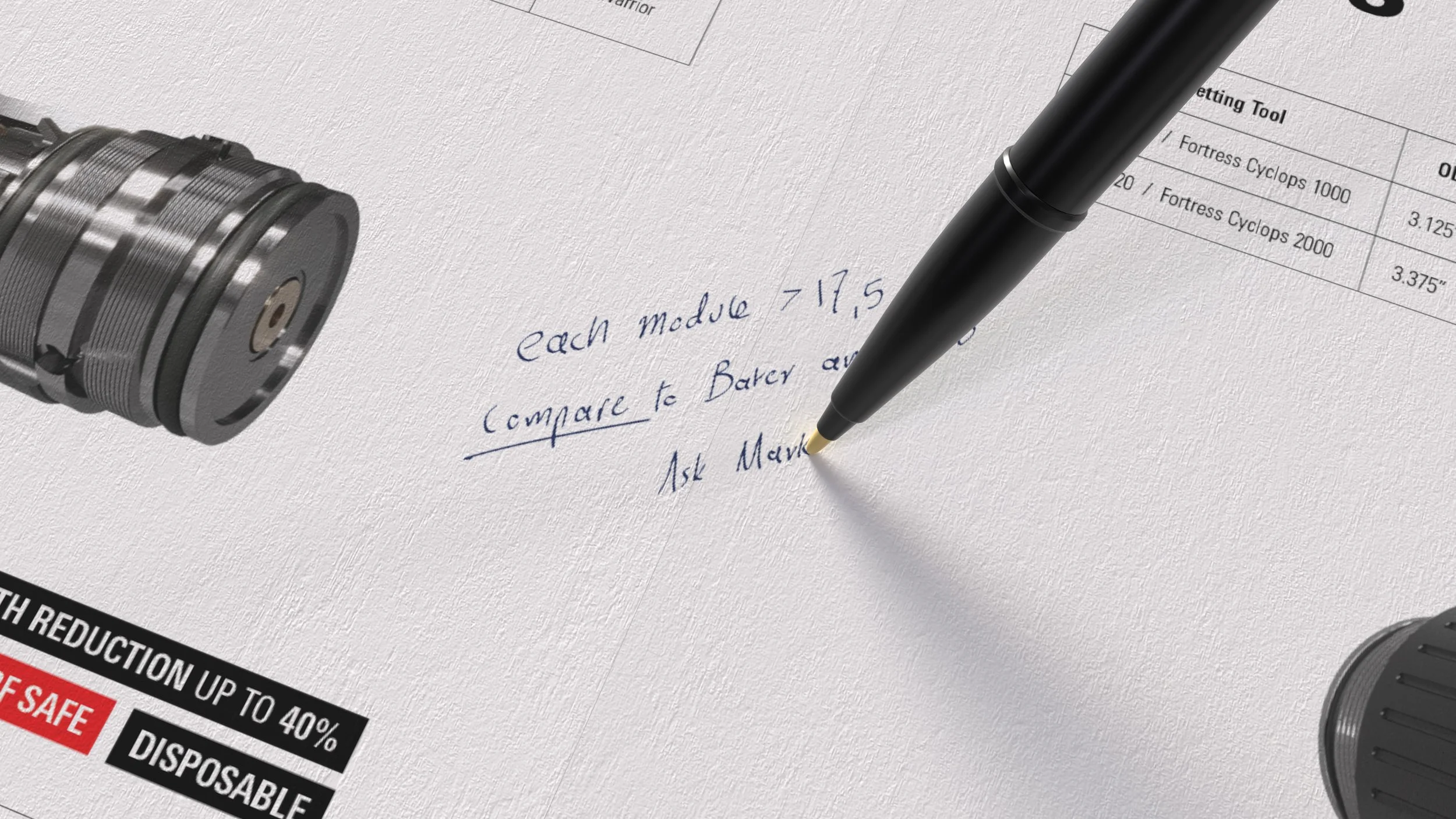
Uncoated paper and generous whitespace make it easy to jot notes directly in the brochure (more interaction).

The perforating systems—Steelhaus USA’s flagship products—are placed front and center on the spread.
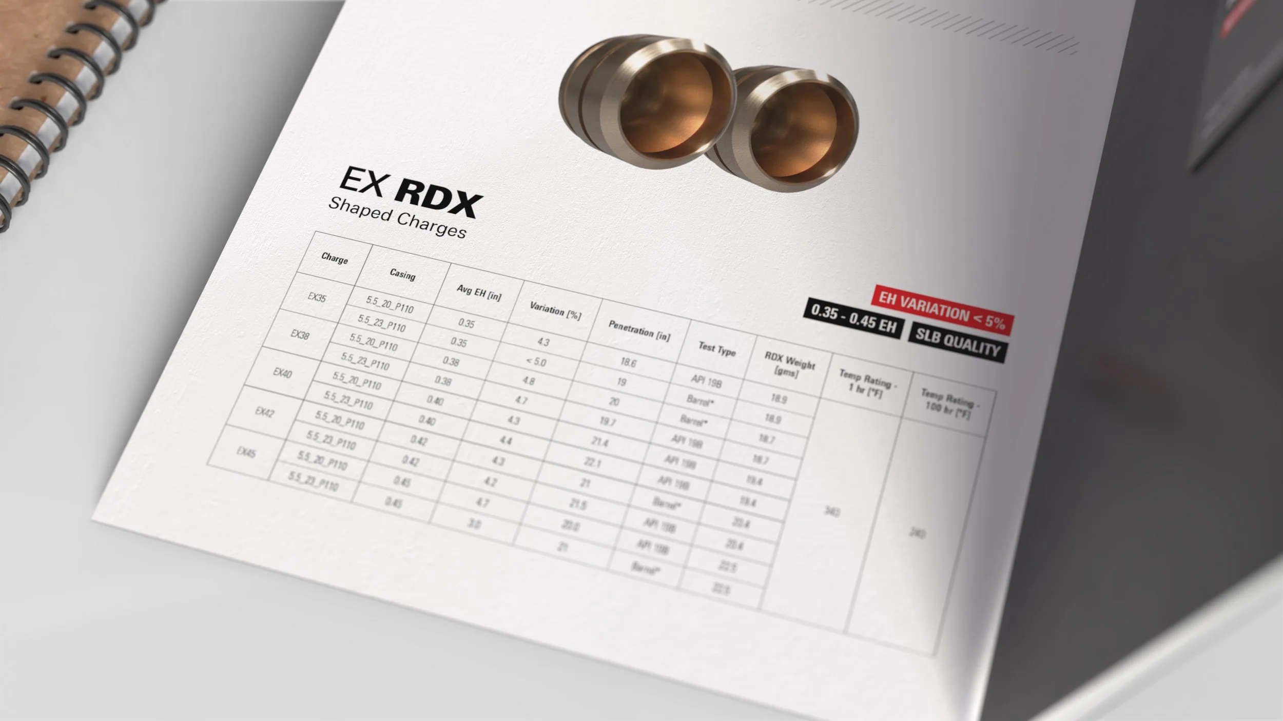
Tables present only the most relevant data, while capitalized product names guide navigation and signal brand’s confidence in its products.
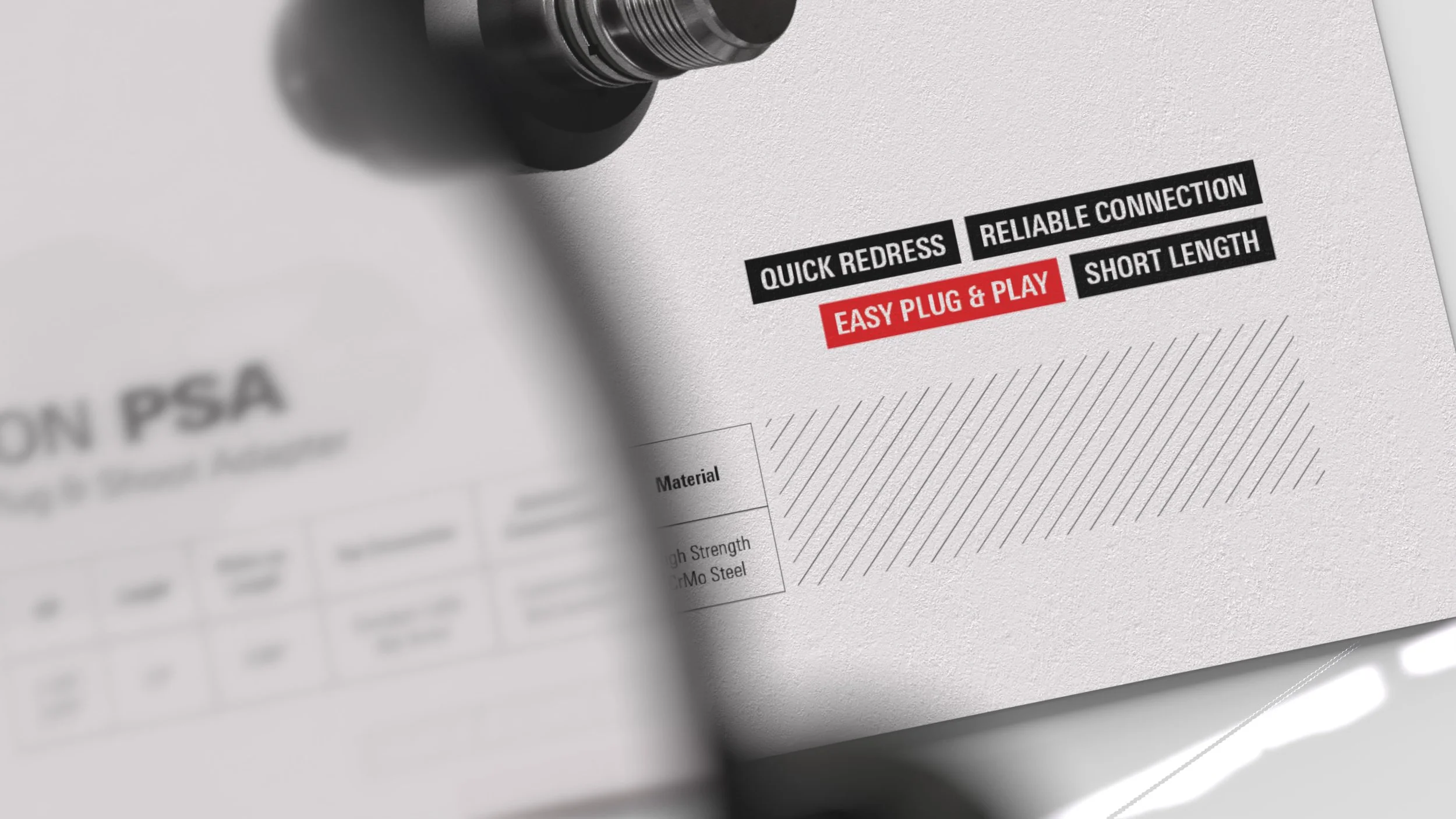
Highlighted product features in bold red accents that draw the eye to key details first, while an angled-line pattern fills the space—echoing striped metal and the precision of technical drawings.
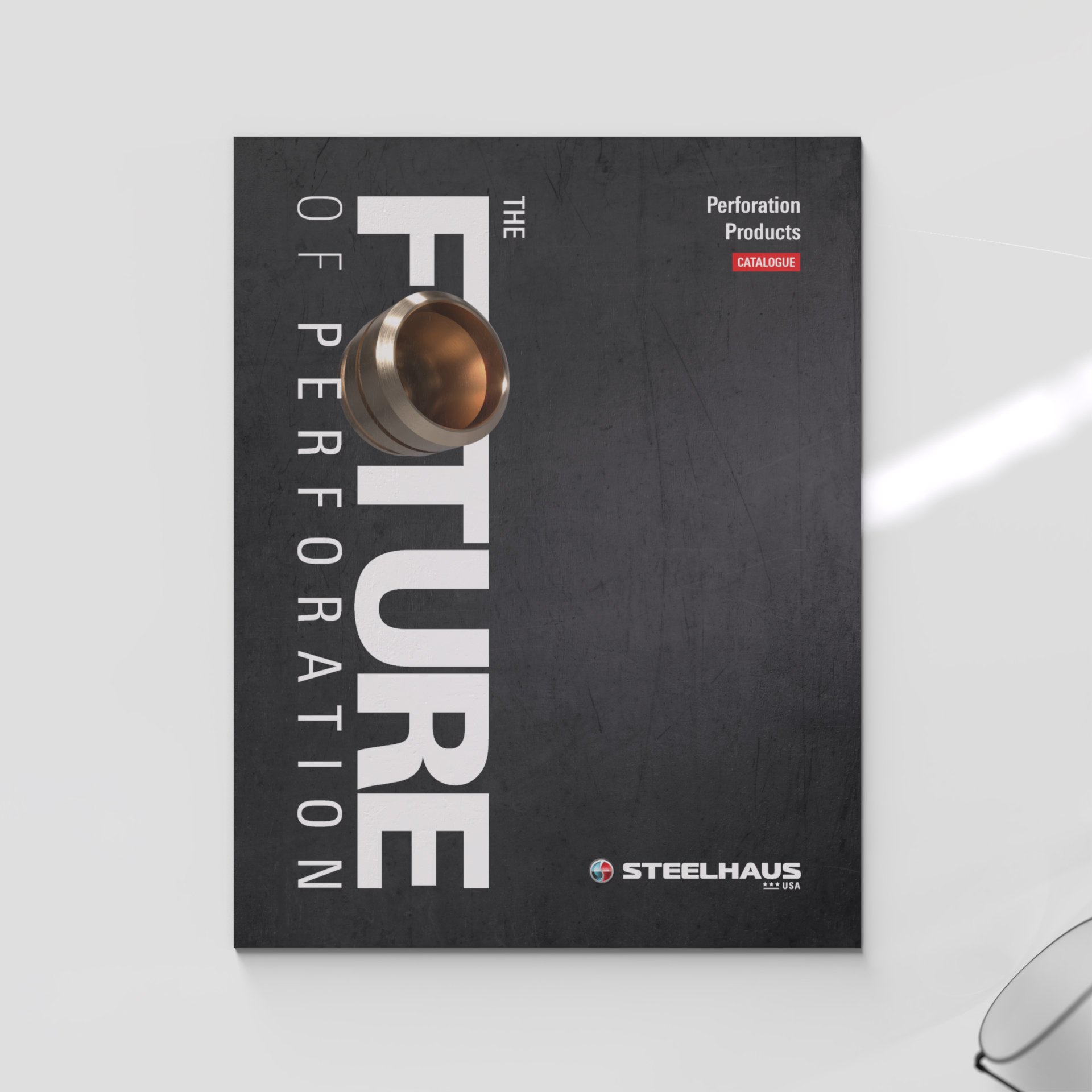
Rough metallic textures on deep graphite, paired with a bold, dynamic headline, present a modern, unapologetically industrial brand built on precision engineering.
Brief:
Create a strong visual direction for Steelhaus USA’s sales materials and design a product catalogue.
The goal is to showcase product reliability while reflecting the brand’s precision, technological edge, and industrial strength.
Outcome:
A clear, confident journey from online pitch to in-person meeting—designed to leave a sharp impression and help close high-value deals.
Process:
I started by reviewing Steelhaus and Steelhaus USA’s websites, previous marketing materials, and competitor catalogs to get a feel for the industry’s visual tone. I also watched product explainer videos to understand how the tools work and where they’re used—gaining insight into the practical environment they serve. To ground the visuals in real-world expectations, I interviewed my client to better understand the audience and their decision-making mindset.
We aligned on a first-impression-driven strategy: a premium tri-fold brochure on thick stock. The layout is clean, technical, and product-forward—built around sharp renders, precise content, and a boldly integrated business card.