JUSTIN HAVRE
Brand Identity
A visual re-brand I led to help Justin’s team withstand the brokerage break and claim the top seat at the Calgary’s real estate market.
Client: Justin Havre Real Estate Team
My Role: Art Direction and Design
Kerning stacked wordmark can be tricky, requiring precise control of both horizontal and vertical spacing.

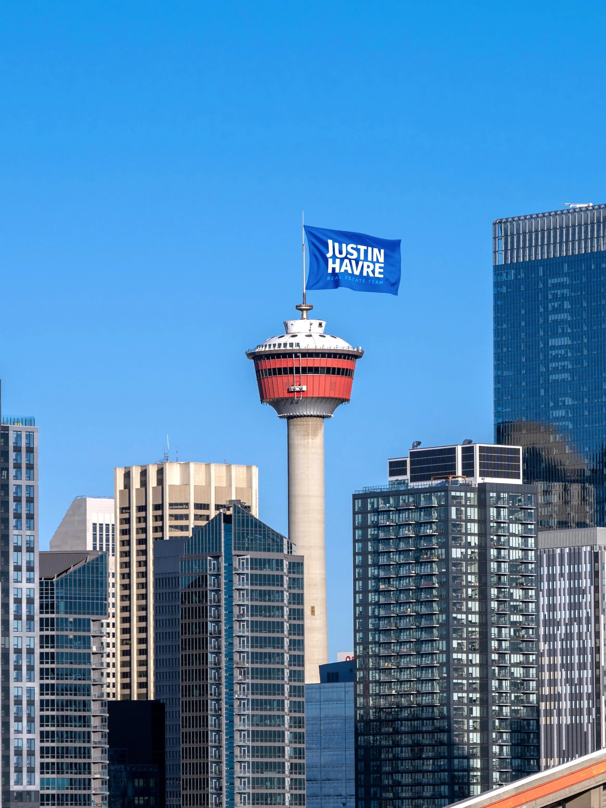
With distant outdoor ads in mind, the wordmark forms a solid block — shapes are recognized faster than letters.


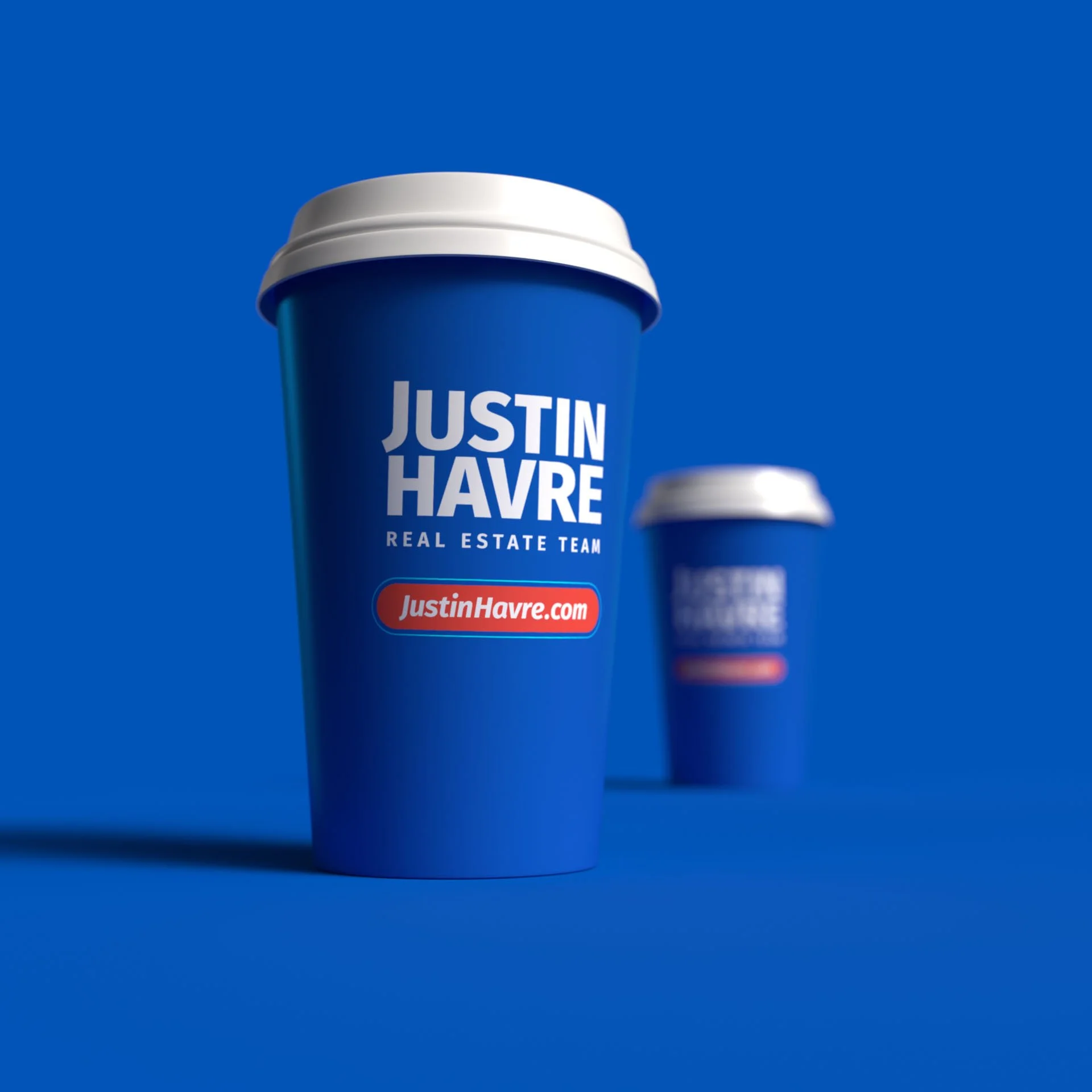
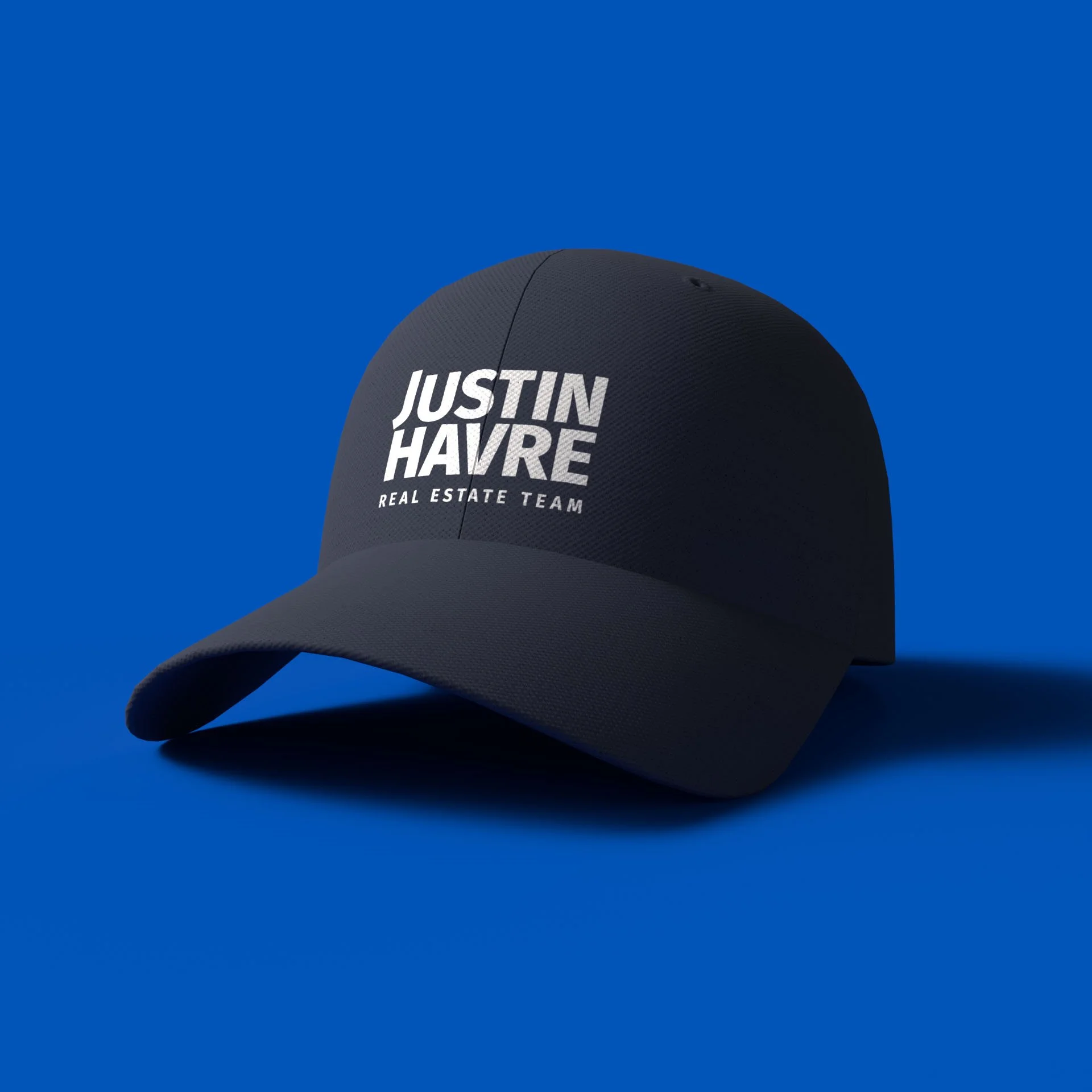
A familiar yet twisted palette reignited brand awareness at a critical moment. Magenta-rich blues keep the color balance leaning warm.
With its wide range of weights and widths, serious yet friendly Fira Sans is a masterpiece of versatility.


As expected from a perfect typeface, it works everywhere — from editorials and digital ads to signs and…the largest outdoor banner in Alberta!

The brokerage logo placement is required on all advertising. I designed multiple brand–brokerage lockups to fit any layout the marketing team or agents might face.

Despite its corporate character, the brand holds strong potential for engaging, creative advertising.
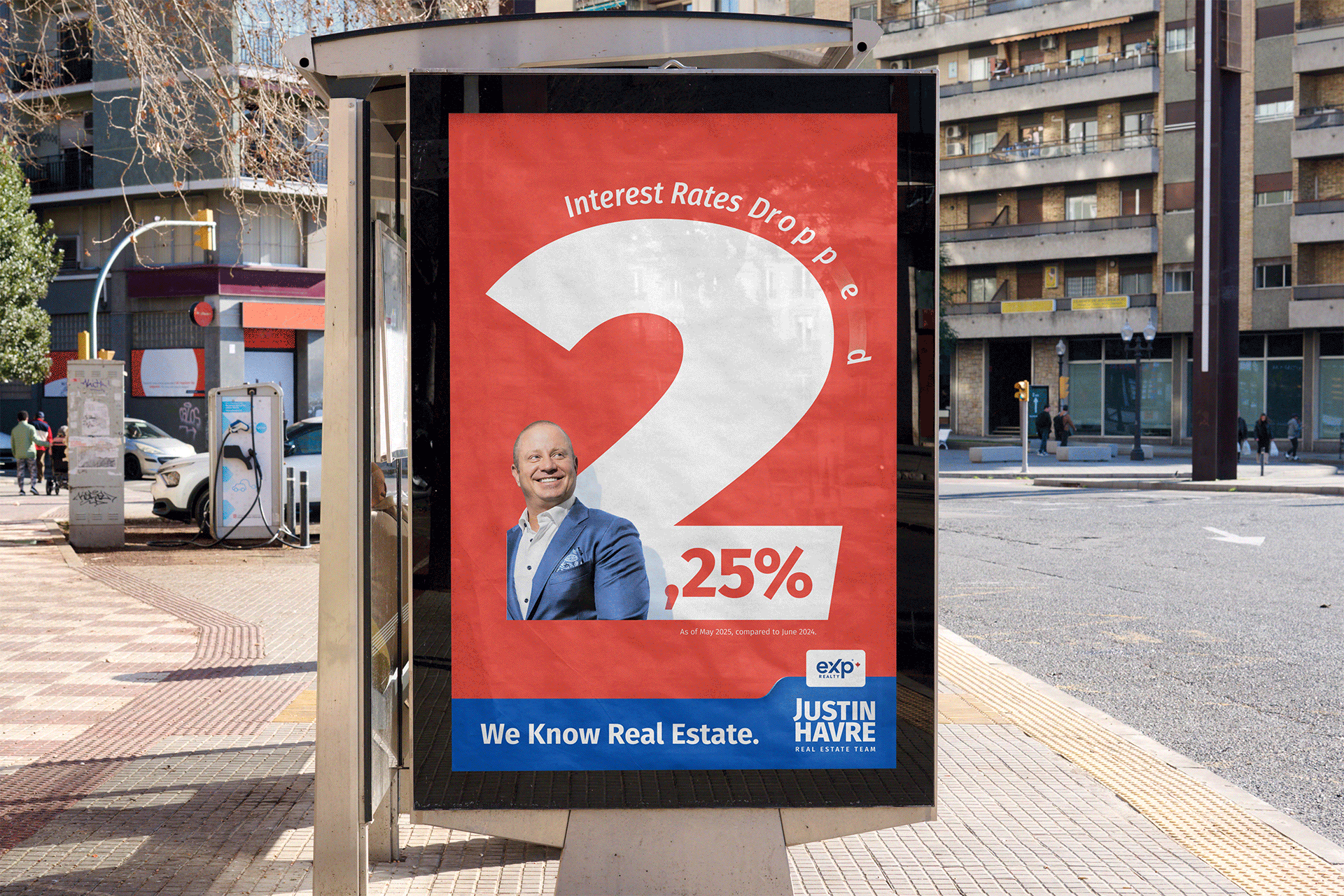
Concept ad strategy built to reinforce the brand slogan


Concept Ad to attract home-sellers.
Brief:
Create a standalone brand identity for the Justin Havre Real Estate Team prior to leaving RE/MAX. Ensure compliance with new brokerage design requirements, maintain nearly two decades of visual recognition, and deliver a system that works seamlessly across print and digital and connects with target audience: home sellers and buyers.
Outcome:
A unified identity that helped preserve and grow brand recognition, setting the stage for successful campaigns and contributing to a 15% sales increase and ~60% agent growth within the first year.
Process:
With just three weeks before the brokerage transition, I led a three-day wordmark design sprint with the JHRET marketing team to replace the RE/MAX logo across all materials. Set on block-shaped wordmark for stronger distant recognition, refreshed the palette to blue-dominant for familiarity without imitation, set Fira Sans as the one-for-all brand typeface, and codified two rules — no all-caps, and one red element per layout so it becomes a true focal point.
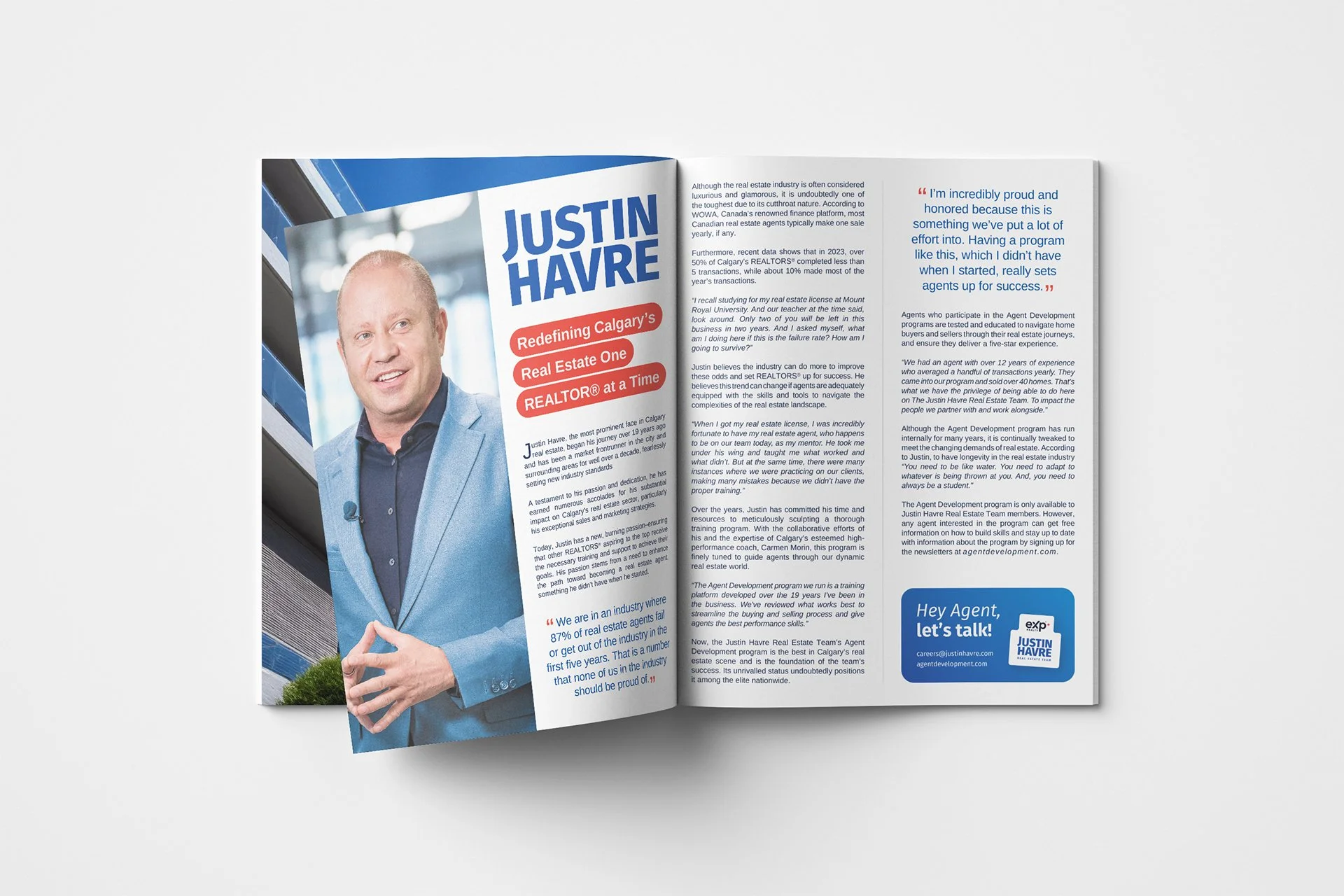
This page presents a mix of launched work and concept pieces built on the Justin Havre Real Estate Team brand. Approved materials were produced in collaboration with the client; the rest are independent explorations pushing the brand further.
All trademarks and brand assets © Justin Havre Real Estate Team;
all concept design © Bartosz Jaskolski.