JK
Brand Identity
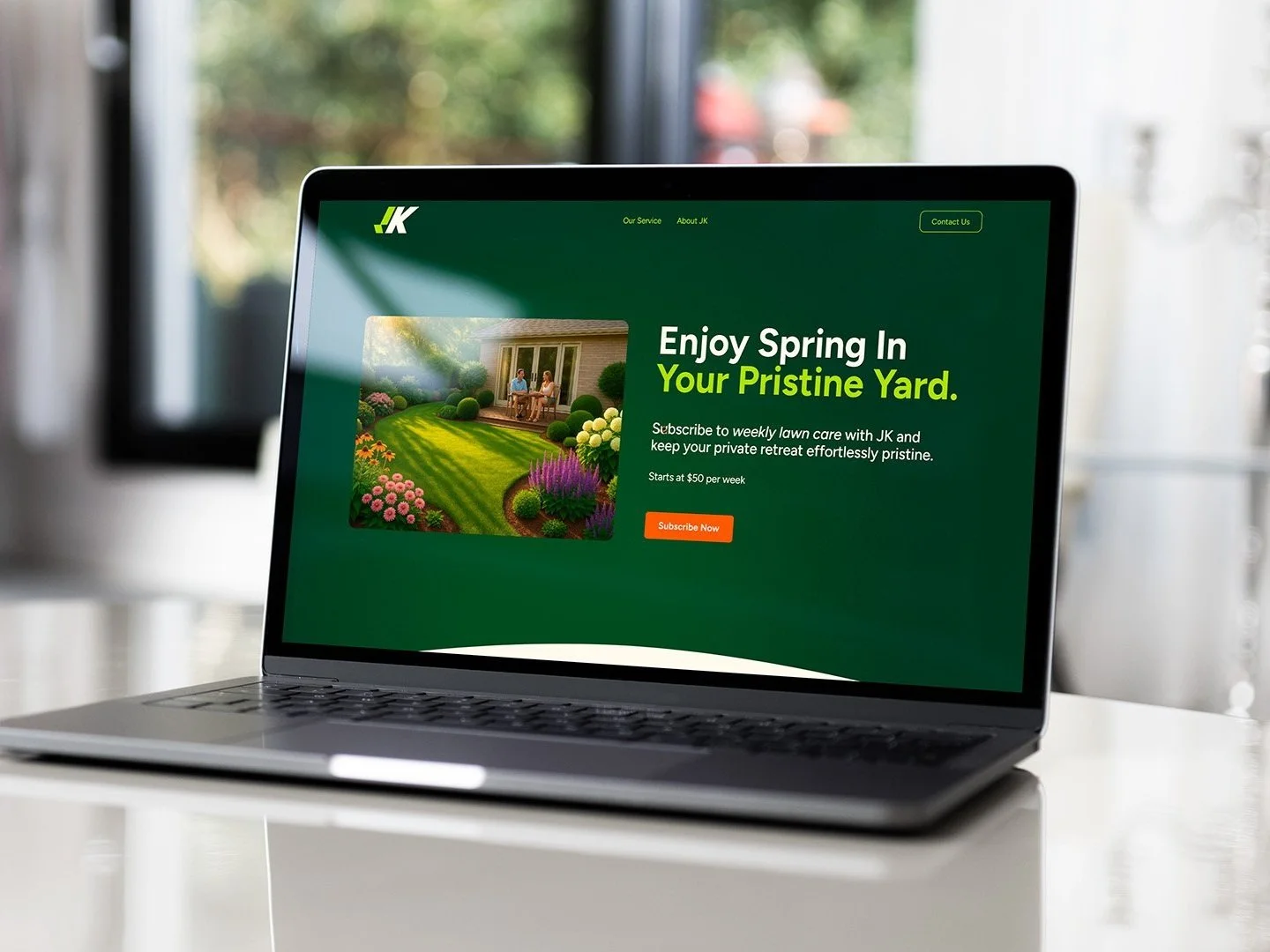
Nature-inspired brand identity and a simple website built to boost credibility and convert quality-driven homeowners.
Client: JK Landscaping
My Role: Creative Direction and Design
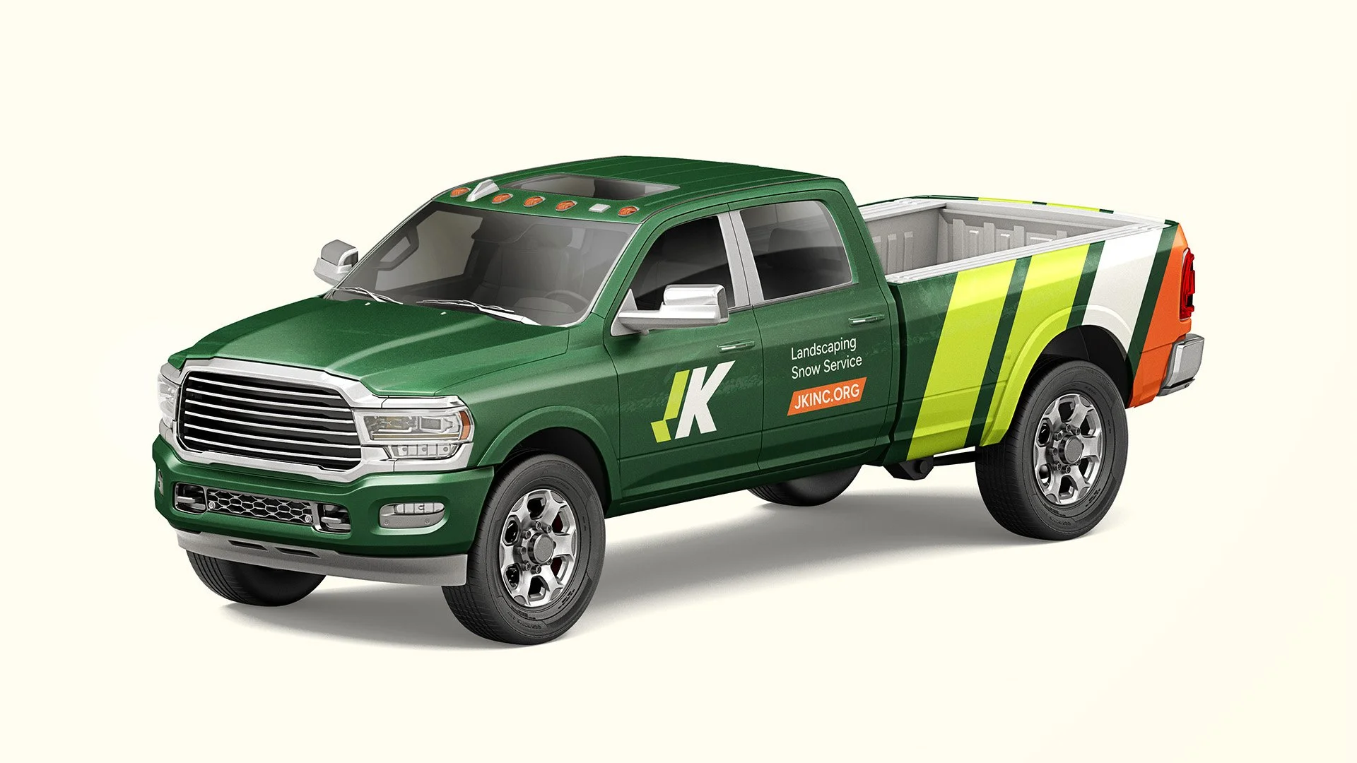
Shortened name to JK and built a bold, flexible mark that scales from truck livery to favicon without losing it’s edge.
Dropping ‘Landscaping’ from the name allowed the brand to tell a consistent story regardless of the service promoted.
“Near, far, wherever you are”
Custom geometric lettering designed for flexibility and impact. The J doubles as a checkmark for a job well done, its forward skew reflecting time-efficient service.

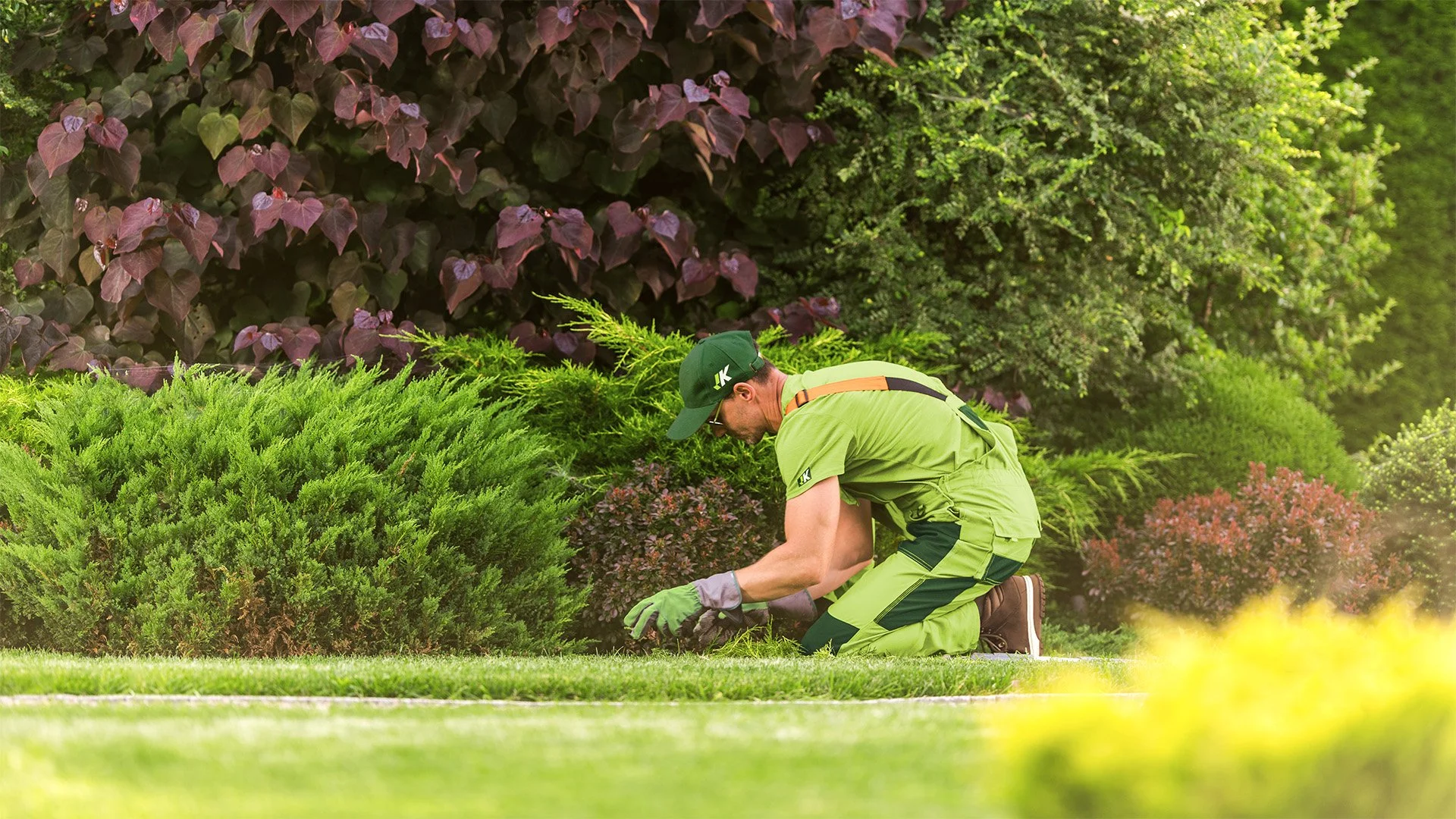
Vibrant, nature-inspired palette reflecting the four seasons ensures high outdoor visibility, even on the smallest surfaces.
Brand typeface: Figtree — a highly readable, versatile sans-serif with a friendly tone that feels inclusive and supports older audiences.
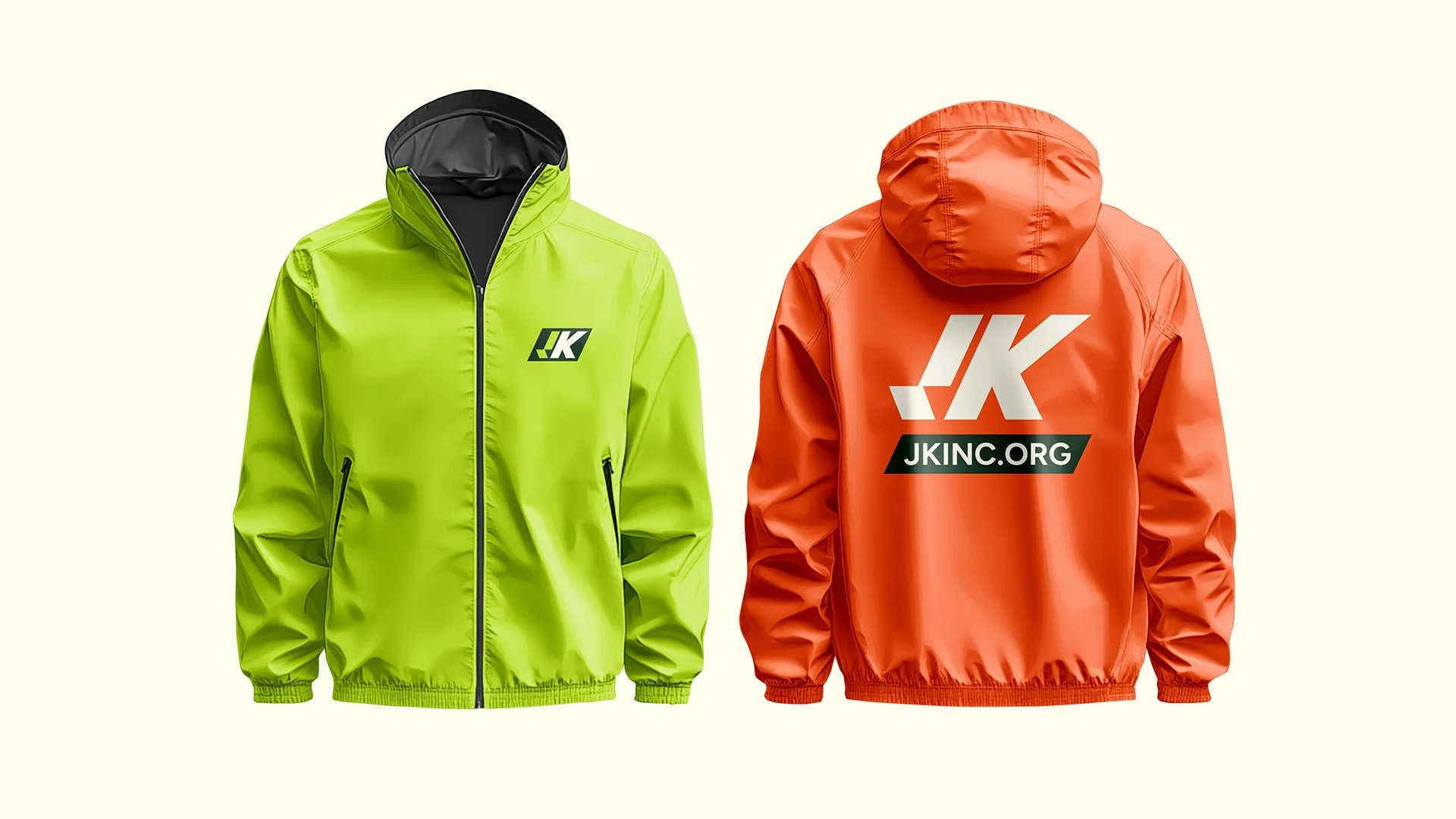
Orange jacket for winter contrast against snow; green for the other seasons.
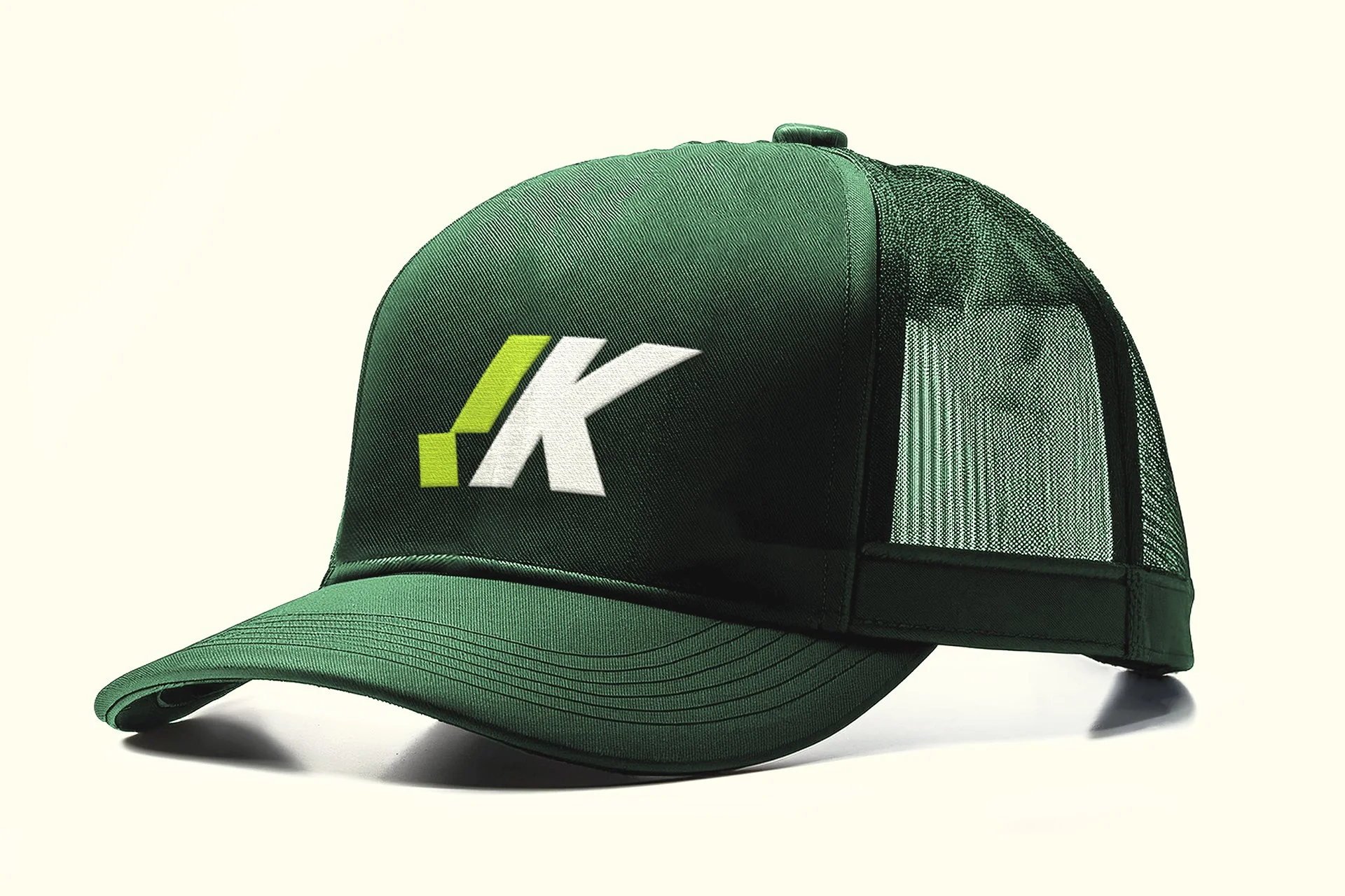

Embroidery and print applications showcase the logo’s versatility.

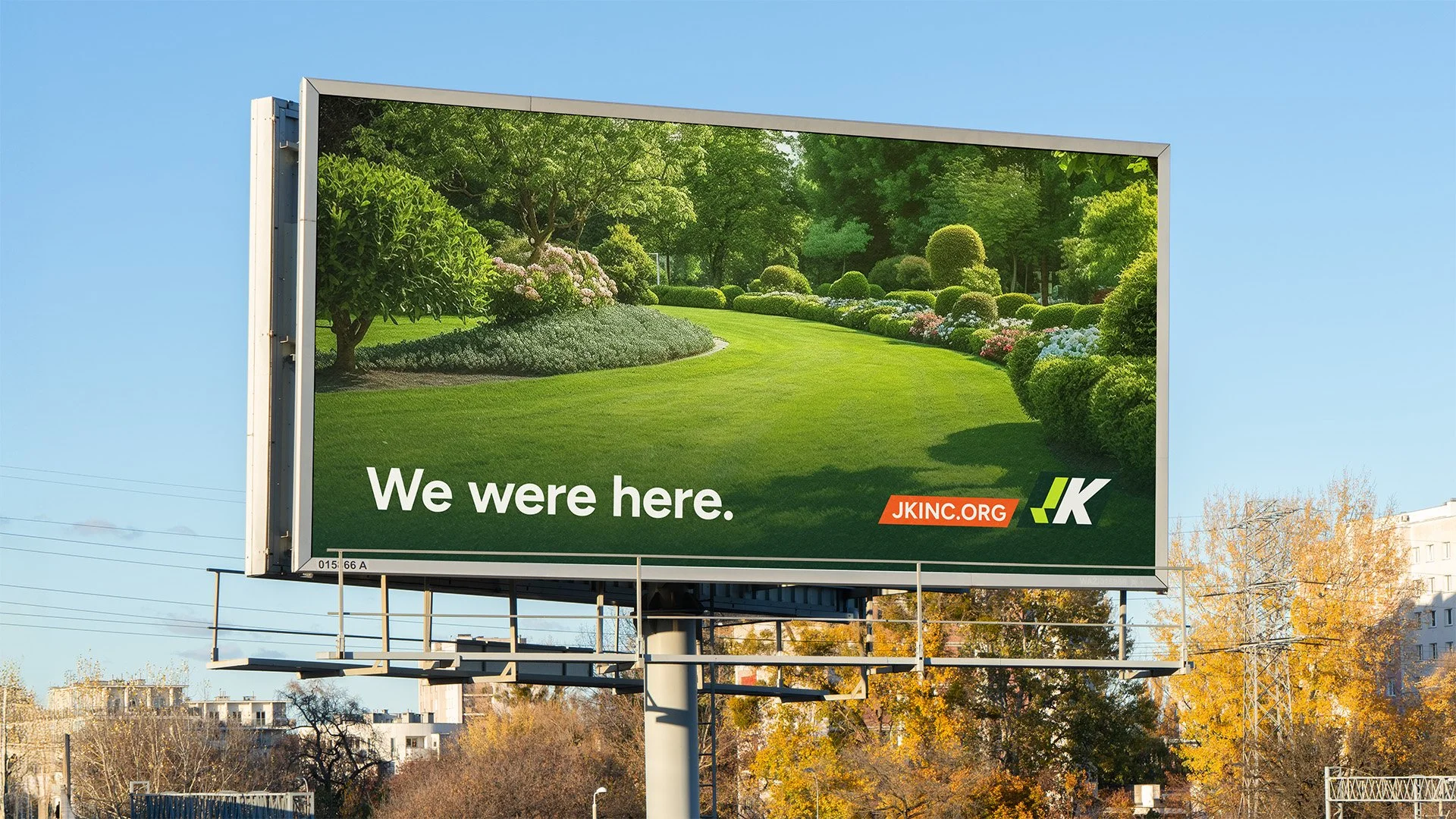
Concept ad created to showcase the brand’s powerful marketing potential.
Explore the branded web experience I designed and built at jkinc.org
Brief:
With 25 years of trusted service, JK Landscaping had a strong reputation but no visual identity to match.
The goal: build a dynamic, confident brand grounded in experience and appealing to quality-driven homeowners who value long-term, reliable service over the lowest price.
Outcome:
~9% client growth since launch, a fresh, consistent identity that stands out across Calgary neighbourhoods, and a credibility-reinforcing digital presence.
Process:
To create a scalable brand, I shortened the name to “JK” and designed a bold, flexible logo signaling presence and control. I chose a nature-inspired, undisturbing palette to convey hands-on reliability and calm professionalism while balancing vibrancy with composure. I paired it with the Figtree typeface for its readability and friendly tone, and used plainspoken copy and large font sizes to ensure accessibility for older audiences.